Exo
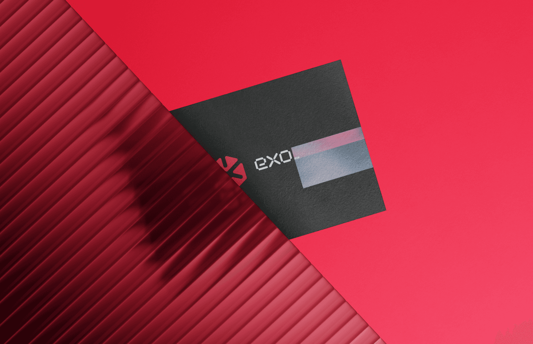
The Exo project is a comprehensive rebranding initiative for Exo, a company revolutionizing the blockchain space. Previously identified by a conservative blue and white color scheme, Exo's new identity embraces bold and daring red and black hues to reflect its innovative and dynamic approach.
Scope
Full Brand Identity and campaign graphics package
Role:
Art Director, Lead Designer
Date:
May 2024
Tools Used:
C4D, Illustrator, Figma, After Effects, Blender, Photoshop, Spline, Modyfi, Redshift

Exo's Bold New Look: A Modular Design for Blockchain Innovation
Exo's brand redesign boldly transitions from conservative blue and white to daring red and black, reflecting their innovative Exocore technology. By integrating a modular design approach, the new identity aligns seamlessly with Exocore's advanced blockchain security solutions.
This strategic transformation highlights Exo's commitment to pushing boundaries and establishing trust in the decentralized landscape. The clear, bold design ensures a memorable market presence, captivating tech-forward audiences and positioning Exo as a leader in blockchain innovation.
Diverse Design Systems for internals and externals.
Exo's rebranding features diverse design systems that cater to both internal operations and external communications, ensuring consistency and cohesion across all touchpoints, enhancing both usability and aesthetic appeal.
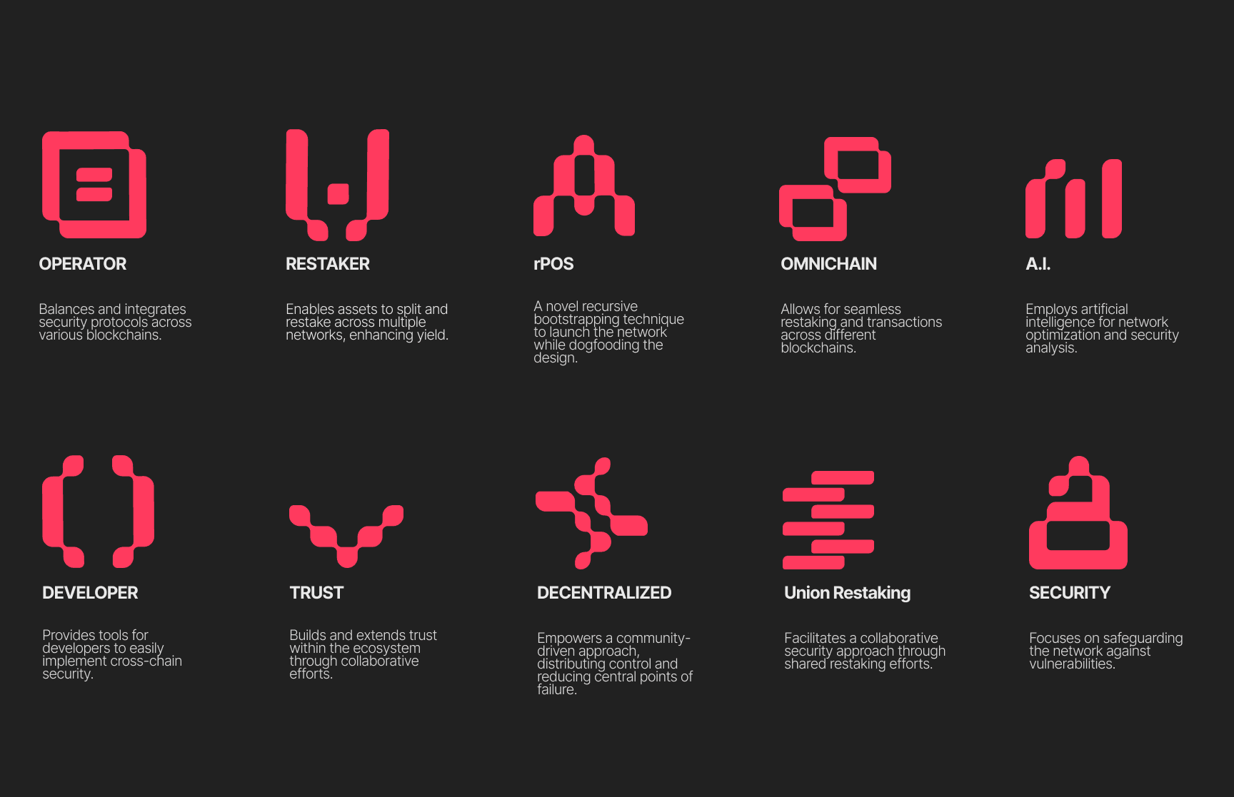
Dynamic Iconography: Reflecting Innovation and Security
Exo's iconography is meticulously crafted to symbolize the robust security and innovative spirit of their Exocore technology. Each icon is designed with a modern, modular aesthetic, ensuring clarity and consistency across all digital and physical platforms, enhancing brand recognition and trust.
Custom Gradients: Infusing Depth and Energy
These gradients are meticulously applied across most design assets, from digital interfaces to marketing materials, ensuring a cohesive and immersive brand presence.

